Coldplay Collaborative Poster Project

Here is another collaborative gig poster I did with Austin artist, Clint Wilson. This time we did a promo poster for a Coldplay performance in Houston at the Toyota Center, complete with free tickets to the show. It was amazing! They filmed the show for an upcoming movie. Everyone got bracelets that lit up with LED lights turning the amphitheater into a concave disco ball with the audience becoming part of the performance.

Glass tile prior to firing. Clint Wilson & Tessa Morrison. 2012.

For this project the idea was for Clint and I to combine two different art techniques to create the resulting poster. So we made a fused glass piece together, took a photo, turned it into half-tone color separations, and then printed a silk-screened poster.

Finished poster design. Clint Wilson & Tessa Morrison. 2012.

Below is a link to video of the whole process:

Coldplay Poster Time-Lapse

This was my first foray with half-tone color separations, I’ve mainly done single color screen printing, and Clint had never worked with fused glass before, so it was definitely a learning experience on both ends. So overall a successful collaboration.

Iron Fuser 3 Submission

This is my second year taking part in the Iron Fuser Competition at Helios Kiln Glass Studio in Austin, Texas. For the past three years Helios has put this annual juried glass art competition together which has had entrants from all around the United States. The title “Iron Fuser” is a spoof on Iron Chef, seeing that we “cook” glass and are given main ingredients that must be used in creating a piece of art. This year the special ingredients were a sheet of neo-lavender tint, a sheet of custom blue streaky, 6″ of copper wire, and the coolest ingredient of all, glow in the dark frit!

“Aoi Yuki”. 2012. Thanks to Helios for the professional photos.

Here are the pictures of the piece I entered, one in normal lighting and one with the lights turned off! You can go in to Helios Kiln Glass Studio and vote for your favorite piece, the winners will be announced on Friday, June 22nd. Voting ends Friday at 7:00 p.m.!

“Aoi Yuki”. 2012. Thanks to Helios for the professional photos.

Strange Kids Club

You know that friend who goes on and on about movies when you simply asked if it was good or not? That’s me. So I’ve started writing movie reviews for the website Strangekidsclub.com.

Above is a sketch I did of the site’s mascot, Strange Kid.

Strange Kids Club is a site for those of you with a love for nerdy nostalgia and contemporary geek news. Whether your poison is comic books, cult/horror movies, cartoons, video games, puppets, toys, or all the above, Strange Kids Club is probably up your alley.

Other than writing articles for the website, I’m currently working on a few pieces for the 3rd Strange Kids Comic Book Anthology.

Clint Prints Logo Fused-Glass Piece

Here is a fused glass piece I made from “float” glass, a.k.a., your standard window glass. The technique used to create the squid involves kiln carving and glass glazes. It is the logo for local gig poster artist, Clint Wilson. I nicknamed the mascot “Squidly”, inspired I know. Unfortunately this adorable cephalopod broke clear in half, but I was able to fix it with some serious UV glue. You can still see the crack, but its still a fun piece regardless. The dimensions are roughly 13X15″.

This slideshow requires JavaScript.

Richard Parrish Color Theory Workshop

Last Wednesday I finished a color theory fused glass workshop at Helios Kiln Glass Studio. The workshop lasted five days from 10:00 a.m. – 5:00 p.m.  The workshop was taught by visiting instructor Richard Parrish from Bozeman, Montana. If you’ve ever seen his work, it is beautifully designed, composed, and executed, which isn’t all too surprising given his being an architect-turned-glass artist.After stopping by the studio last year when he was teaching this same class I came to the conclusion that I had to take it: not only as a general refresher in color theory, but also to better understand how different colored opaque, transparent, and tinted glass interact with one another. (F.Y.I. glass does not mix like paint and can and probably will do weird things if you haven’t experimented enough to know what to expect).The workshop was fun and it was equally involved and labor intensive. I also didn’t realize just how physically and mentally exhausting it could be to stare at bright colors for hours at a time. We had several assignments to complete every day and had access to every color of BullsEye glass, with a few restrictions (no black or white).

We had a great group of people (there were 8 students, including myself) and we all learned as much from each other as we did the instructor. The point wasn’t to make an awesome finished cold-worked piece, but rather learn as much about color interaction as possible. These pictures are of the larger tiles I did after doing numerous smaller test tiles.Richard Parrish will be back to teach a design class as well. I am definitely looking forward to it!

Collages

Found these while rummaging through some old boxes my dad dropped off the last time he was in town. These pieces are some of my first and very few explorations into collage.

Conversation Over Dinner. 2004.

You can tell which items I added to the table because they don’t cast a shadow.

Phonelines. 2004.

They are images cut out old National Geographics.

New Studio Space!

My jewelry design project, REfused Designs Studios, has a new home! Here is a picture of the set-up at the new studio space off of Northloop. Its about 400 square feet, wood floors, and one wall is covered in a mirror. The space was used previously as a dance studio where they taught bellydance, pilates, and yoga. I’m sharing the space with painter Pat Taylor. We might be in the West Austin Studio Tour this year. From what I hear it’s the Spring version of the East Austin Studio Tour and it basically encompasses the rest of Austin. I’ll probably use the space for larger fabric sculpture, puppet making, and perhaps some filming. I’ve had an idea for a film project that I really want to do.

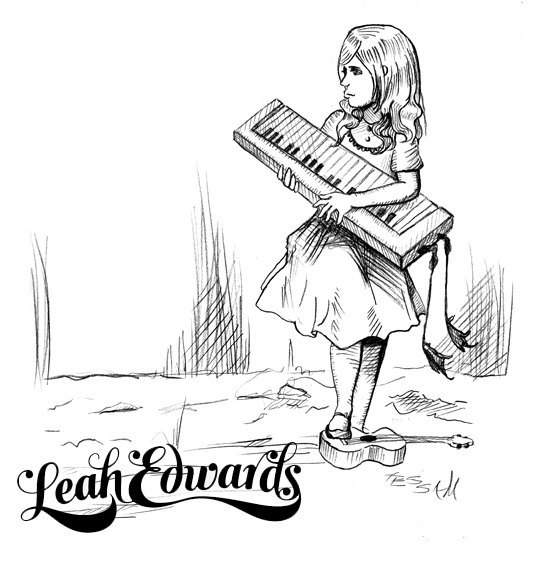
Leah Edwards Album Cover

Taking a break from the fused glass posts, friend and musician, Leah Edwards has commissioned me to design her album cover. Originally from Texas, I met her in Austin while we were both interns for the Downtown Austin Alliance, doing P.R. and street teaming for their 4th season of PBS/KLRU TV show “DOWNTOWN”. We were thrown into a room together to bundle up thousands of postcards for promotions, and instantly hit it off. Now she resides in Nashville, Tennessee where she is attending grad school and pursuing her musical career.

Her music is best described as Folk/Americana. I did a couple of designs for her and this seems to be the one we are going forward with:

I designed a similar font, but she ended up going with one designed by another friend of hers. I need to get their name to give them credit. This design is based on a well-known Lewis Carroll illustration of Alice.

Here is a poster design I did for Leah a few years back for her to promote her shows:

I keep saying that Leah is going to be the next Regina Spektor. She is one of the most kind-hearted people I know and she puts her all into her music. I only have tons of love for this wondrous lady.

Check her out at: http://www.myspace.com/leahmarieedwards

I think there is a video of us singing in her car while running errands for our internship. Fun times…

Sundown T-shirt Design

Sundown is a Columbus-based, psych-folk-rock band that is comprised of my brother, Dustin White, T. K. Webb, Vug Arakas, and Chris Pierce. They will be in Austin for SXSW this year. Dusty asked me to draw up a design for their shirts. He gave me a few references and here’s what I came up with:

She’s 50% Farrah Fawcett, 25% Ralph Bakshi, 15% pin-up, and 10% Sailor Jerry tattoo.

Fused Glass Latticework

I sat in on a glass fusing class at Helios on Anderson Mill and we were making what they have coined “glass latticework.” It’s a non-traditional technique using strips of glass fused together with large spaces in between. This technique has a more overall organic shape after it is fired than what I generally lean towards with my jewelry and glass art designs, but I figure it’s good to try everything.

Piece prior to fusing.

I forgot to take a picture of the second step before slumping it. So the the pictures on here are the first and third steps of the process: pre-firing and post-slumping. After it slumps it will look like a glass basket of sorts.

It seems that one of my corners came undone during firing, so it didn’t do what I expected. So now I have a glass basket with a long hoop for hanging. Which is a neat accident, as far as accidents go.

One side looks like a human ribcage, complete with upside down xiphoid process.

If you’re interested in learning to make fused glass, check out Helios.com’s Beginners class schedule.